Brand
Our Name
The name, BEAKE, derives from the names of the founders, Bheki, Abrey and Kealeboga spelt creatively to connote the “BEAKE” of a bird.
The bird implied in “BEAKE” represents the natural environment while the BEAKE, as relates to pecking, connotes working the natural environment (as a bird would peck a tree to either feed or build).
The relevance of this is that we make the most of the natural environment for the benefit of humanity, doing so in responsible and sustainable ways.

Our Brand Line
Our brandline “As You Venture On. Choose Difference. Choose BEAKE.” is premised on the notion that:
- Clients, like all humans, are on a continuous quest to do better, accomplish more, and become more.
- As such, in their pursuit of a better and more, they should make a differentiated choice.
After all:
- We believe in a different tomorrow, and that, to deliver it, we need to think and act differently.
- Thinking and acting differently is what we bring to our client’s every ‘next’.
“As You Venture On, Choose Difference, Choose BEAKE.”

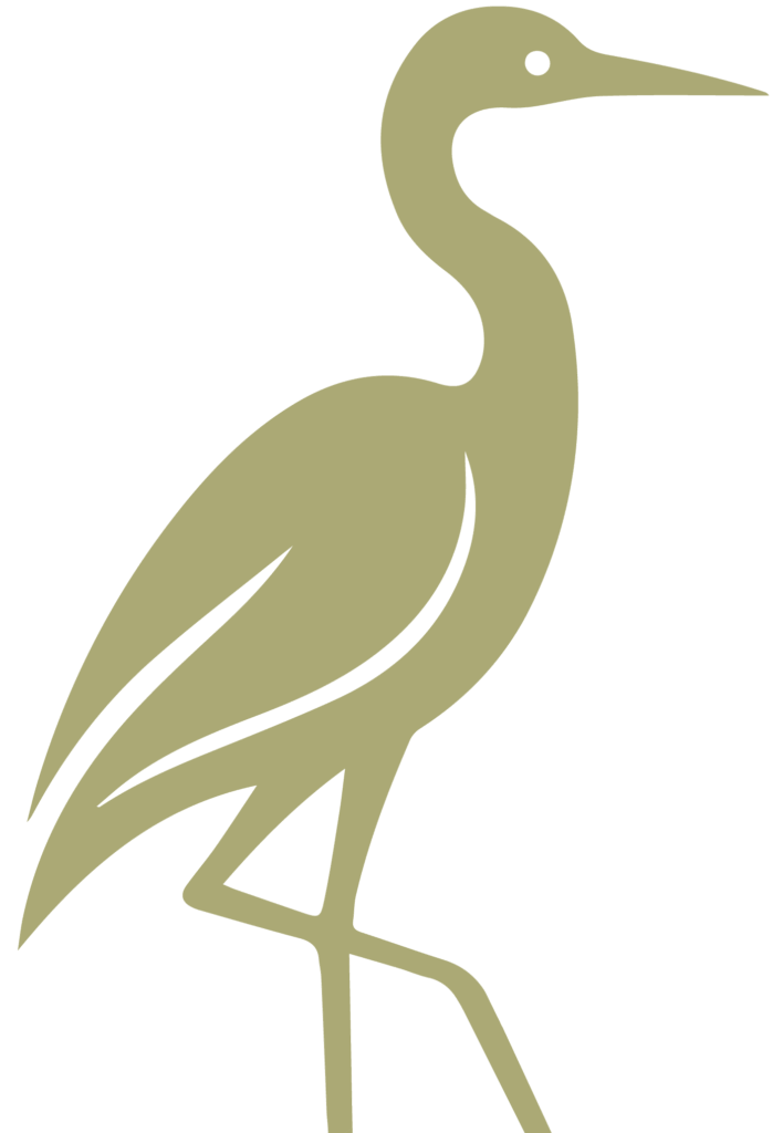
Our Logo
Our logo captures the essence of our business, i.e. making the most of the natural environment for the benefit of humanity, and doing so in responsible and sustainable ways.
- The Bird, specifically the Blue Crane – South Africa’s national bird – represents Nature (fauna) and the BEAKE of a bird as connoted in our brand name.
- The Mountains represent the Land we mine with Afrika as a tacit reference given her mineral riches.
- The Green colour represents Nature (flora) as it connects to our notion of responsible and sustainable business.
- The Beige colour represents Nature, specifically the land we mine for the benefit of humanity.
With the logo, our proposition is that nature, mining, engineering, and business in general can thrive in harmony.
What better way to affirm what we believe than through our very identity.